Every SaaS app needs a dashboard. The problem is that building one from scratch in Blazor means wiring up chart libraries, designing card layouts, handling responsive grids, and making it all look consistent. That takes days, not minutes.
In this tutorial, you will build a complete SaaS admin dashboard in Blazor using Arcadia Controls — from project creation to a fully working page with KPI cards, charts, progress bars, and sparklines. Total time: about 10 minutes.
What We Are Building
A realistic admin dashboard with:
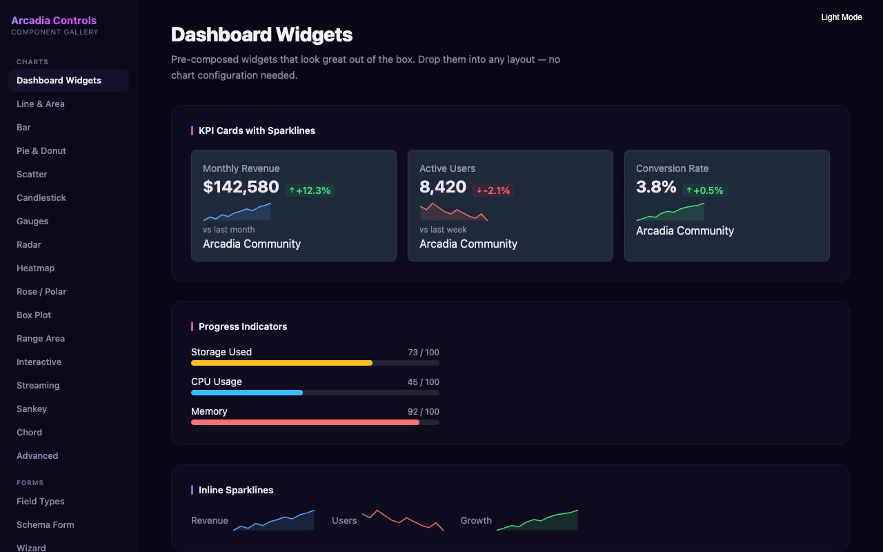
- 4 KPI cards showing revenue, users, orders, and conversion rate
- Line chart for revenue trends over time
- Bar chart for sales by category
- Progress bars for goal tracking
- Sparklines for inline trend indicators
The final result works in Blazor Server, WebAssembly, and Auto render mode without any changes.
Step 1: Create the Project
Start with a standard Blazor Web App (.NET 8 or later):
dotnet new blazor -n SaasDashboard -int Auto
cd SaasDashboard
Step 2: Install Arcadia Packages
You need the Charts package (includes dashboard widgets) and the Theme package:
dotnet add package Arcadia.Charts
dotnet add package Arcadia.Theme
Step 3: Register the Theme
Add the Arcadia CSS to your App.razor inside the <head> section:
<link rel="stylesheet" href="_content/Arcadia.Theme/css/arcadia.css" />
<link rel="stylesheet" href="_content/Arcadia.Charts/css/arcadia-charts.css" />
That gives you light/dark mode support, design tokens, and all chart styles.
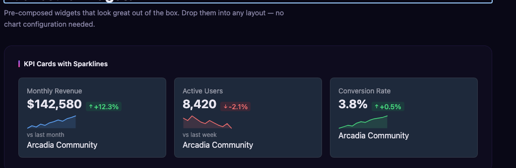
Step 4: Add KPI Cards
Create a new page at Components/Pages/Dashboard.razor. Start with a row of KPI cards:
@page "/dashboard"
@using Arcadia.Charts

<div class="grid grid-cols-1 md:grid-cols-2 lg:grid-cols-4 gap-6 mb-8">
    <ArcadiaKpiCard Title="Revenue"
                    Value="$48,250"
                    Change="12.5"
                    ChangeDirection="TrendDirection.Up"
                    Icon="dollar-sign" />

    <ArcadiaKpiCard Title="Active Users"
                    Value="3,842"
                    Change="8.1"
                    ChangeDirection="TrendDirection.Up"
                    Icon="users" />

    <ArcadiaKpiCard Title="Orders"
                    Value="1,247"
                    Change="-2.3"
                    ChangeDirection="TrendDirection.Down"
                    Icon="shopping-cart" />

    <ArcadiaKpiCard Title="Conversion"
                    Value="3.24%"
                    Change="0.8"
                    ChangeDirection="TrendDirection.Up"
                    Icon="trending-up" />
</div>
Each card renders as an accessible, themed component. The Change value shows a green or red badge automatically based on the ChangeDirection.
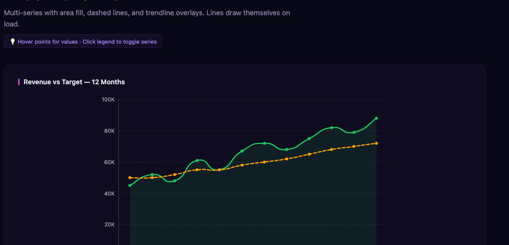
Step 5: Add a Line Chart for Revenue Trends
Below the KPI row, add a revenue trend chart:
<div class="grid grid-cols-1 lg:grid-cols-2 gap-6 mb-8">
    <div class="bg-white dark:bg-gray-800 rounded-xl p-6 shadow-sm">
        <h3 class="text-lg font-semibold mb-4">Revenue Trend</h3>
        <ArcadiaLineChart TItem="MonthlyData"
                          Data="@revenueData"
                          XField="@(d => (object)d.Month)"
                          Series="@revenueSeries"
                          Height="300"
                          Width="0"
                          ShowPoints="true"
                          ShowTooltips="true"
                          ShowCrosshair="true"
                          YAxisTitle="Revenue ($k)" />
    </div>
The Width="0" parameter makes the chart responsive — it fills the available container width automatically.
Step 6: Add a Bar Chart for Category Sales
Continue the two-column grid with a bar chart:
    <div class="bg-white dark:bg-gray-800 rounded-xl p-6 shadow-sm">
        <h3 class="text-lg font-semibold mb-4">Sales by Category</h3>
        <ArcadiaBarChart TItem="CategoryData"
                         Data="@categoryData"
                         XField="@(d => (object)d.Category)"
                         Series="@categorySeries"
                         Height="300"
                         Width="0"
                         ShowTooltips="true"
                         ShowValues="true" />
    </div>
</div>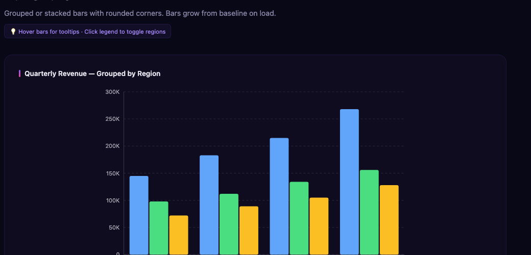
Step 7: Add Progress Bars for Goal Tracking
Add a section with progress bars to show team goals:
<div class="bg-white dark:bg-gray-800 rounded-xl p-6 shadow-sm mb-8">
    <h3 class="text-lg font-semibold mb-4">Quarterly Goals</h3>
    <div class="space-y-4">
        <ArcadiaProgressBar Label="Revenue Target"
                            Value="72"
                            Max="100"
                            FormatString="{0}%"
                            Color="#8b5cf6" />

        <ArcadiaProgressBar Label="New Customers"
                            Value="184"
                            Max="250"
                            FormatString="{0} / {1}"
                            Color="#ec4899" />

        <ArcadiaProgressBar Label="Support Tickets Resolved"
                            Value="412"
                            Max="500"
                            FormatString="{0} / {1}"
                            Color="#10b981" />
    </div>
</div>
Progress bars support custom format strings so you can show percentages, fractions, or any label you need.
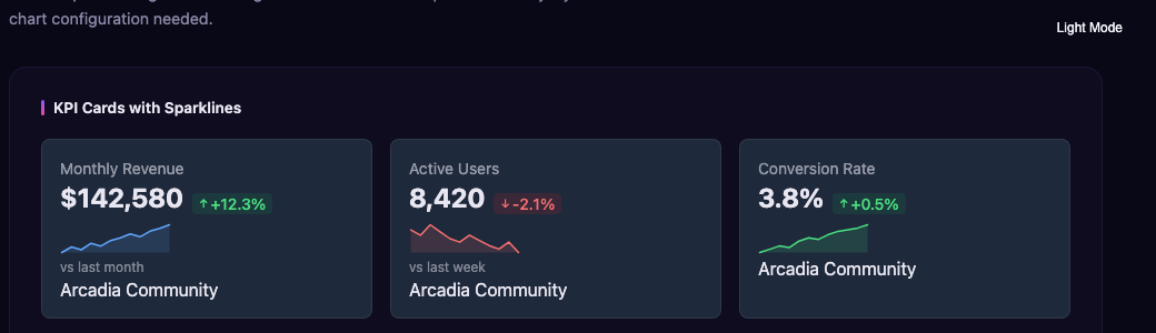
Step 8: Add Sparklines for Inline Trends
Finally, add a row of sparkline widgets. Sparklines are tiny inline charts perfect for showing trends alongside numbers:
<div class="grid grid-cols-1 md:grid-cols-3 gap-6">
    <div class="bg-white dark:bg-gray-800 rounded-xl p-6 shadow-sm">
        <span class="text-sm text-gray-500">Page Views (7d)</span>
        <ArcadiaSparkline Data="@(new[] { 120.0, 145, 132, 168, 155, 189, 201 })"
                          Height="40"
                          Width="0"
                          Color="#8b5cf6"
                          ShowArea="true" />
    </div>

    <div class="bg-white dark:bg-gray-800 rounded-xl p-6 shadow-sm">
        <span class="text-sm text-gray-500">Signups (7d)</span>
        <ArcadiaSparkline Data="@(new[] { 22.0, 31, 27, 35, 29, 42, 38 })"
                          Height="40"
                          Width="0"
                          Color="#ec4899"
                          ShowArea="true" />
    </div>

    <div class="bg-white dark:bg-gray-800 rounded-xl p-6 shadow-sm">
        <span class="text-sm text-gray-500">API Calls (7d)</span>
        <ArcadiaSparkline Data="@(new[] { 8400.0, 9200, 8800, 11200, 10500, 12800, 13100 })"
                          Height="40"
                          Width="0"
                          Color="#10b981"
                          ShowArea="true" />
    </div>
</div>
Step 9: Add the Data Models and Sample Data
Add the @code block at the bottom of the page:
@code {
    record MonthlyData(string Month, double Revenue, double Costs);
    record CategoryData(string Category, double Sales);

    private List<MonthlyData> revenueData = new()
    {
        new("Jan", 32.5, 22.1), new("Feb", 36.8, 24.3),
        new("Mar", 34.2, 23.8), new("Apr", 41.5, 26.2),
        new("May", 45.1, 27.9), new("Jun", 48.3, 29.1)
    };

    private List<SeriesDefinition<MonthlyData>> revenueSeries = new()
    {
        new() { Name = "Revenue", Field = d => d.Revenue, Color = "#8b5cf6" },
        new() { Name = "Costs", Field = d => d.Costs, Color = "#f59e0b" }
    };

    private List<CategoryData> categoryData = new()
    {
        new("Electronics", 18400), new("Clothing", 12800),
        new("Home & Garden", 9600), new("Sports", 7200),
        new("Books", 5100)
    };

    private List<SeriesDefinition<CategoryData>> categorySeries = new()
    {
        new() { Name = "Sales ($)", Field = d => d.Sales, Color = "#8b5cf6" }
    };
}
Step 10: Run It
dotnet runNavigate to /dashboard and you have a fully working SaaS admin dashboard. Every component supports dark mode out of the box — toggle the Arcadia theme and the entire dashboard adapts.
Why This Approach Beats Building from Scratch
Building the same dashboard from scratch means:
- Choosing and integrating a JavaScript chart library
- Writing custom CSS for KPI cards and layout
- Handling responsive breakpoints manually
- Adding dark mode support across every element
- Implementing accessibility for screen readers
With Arcadia Controls, all of that is handled. The components render as pure SVG from C# — no JavaScript dependencies, no canvas elements, no interop configuration. Everything participates in normal Blazor rendering and lifecycle.
Next Steps
This tutorial covers the basics. Here are ways to extend your dashboard:
- Add a Gauge widget for real-time metrics (Gauge docs)
- Connect to live data using Arcadia’s streaming data support
- Add click handlers to charts for drill-down navigation
- Export charts to PNG or SVG for reports
The Community Edition of Arcadia Controls is free forever with an MIT license. Install it and start building.
dotnet add package Arcadia.ChartsUseful links:
- Documentation — full API reference
- Chart Playground — interactive chart builder
- Free Blazor Charts — what is included in the free tier
- GitHub — source code and issues